The Chart That Tells The Music Business Story
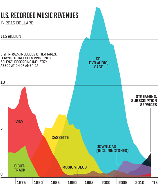
 Rarely does one chart say so much about how an industry goes as does this one from Fortune. It’s the revenue generated by the recorded music business over the last 40+ years, and it shows the staggering loses that it suffered with the onset of digital music, as well as how the industry has responded to the incorporation of each new music delivery technology.
As you can see, back in the late 70s the industry was fairly healthy in that vinyl sales where at their highest, supported by the first somewhat portable format (in your car, at least), the 8 track tape.
As we get into the 80s the CD takes over, bolstered at least for a time by cassette sales, and it reaches a peak around 2001. This peak is far beyond what the industry had seen before, or since, by almost a factor of 2. Much of this had to do with the fact that the prices for its products were also the highest they’d ever been.
In around 2007 we see that downloads peak in revenue, but the industry is still mostly supported by CD sales, even though they’re declining at a rapid pace, a reaction by consumers to the high prices.
By the end of 2015 CDs are still selling, but at only a fraction of their previous peak, while streaming is increasing at a rapid rate.
If we were to look at an extended chart at the end of 2016, we’ll see that streaming has an even greater growth than what’s seen here, with the general health of the music business revenue-wise beginning to return.
While it’s unlikely that the industry will see anything like the halcyon days of 1999-2001 again (unless a new hit physical format is created), at least it’s growing again. For the first time in a long time, there’s optimism in the air, although you wouldn’t know it from this chart.